
Tips from an Art Teacher: Making Classroom Posters Better
2 Min Read • Classroom Setup
As an art teacher, naturally I get asked art-related questions from classroom teachers. By far, the most asked questions is, “How can I get my students to make more attractive posters for class projects?” Teachers and students want their projects to look good but are not always sure where to start or how to make that happen. I facilitated a professional development on this and it was so heavily attended that I thought I would share some simple basics and reminders in this article about what students can do to make their classroom posters look better.
First of all, students should plan ahead. They can draw a sketch of their poster and where they want certain information and content to go. Planning ahead will lead to better results. Sketching a layout can be advantageous whether you are using paper and pencil or a technology application.
Drawing Posters on Paper
- Color: “Draw Light, until you know it’s right.” This prevents what I call, Ghost Lines. These are lines that never really go away no matter how hard you erase. Outline your drawings with black pen to make them stand out. Press down a little harder with colored pencils and crayons than you normally do. If you want, add shading by altering the pressure.
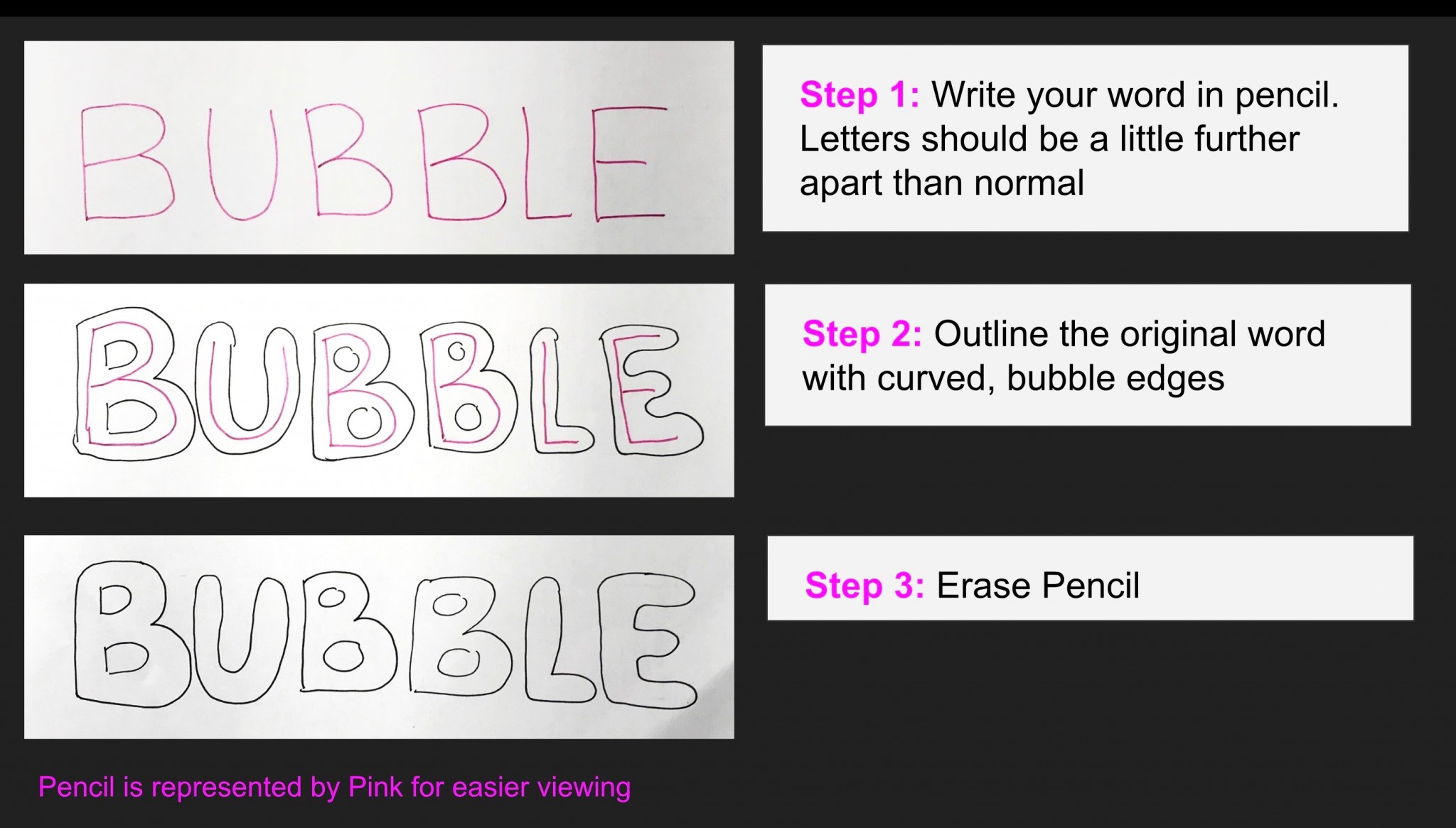
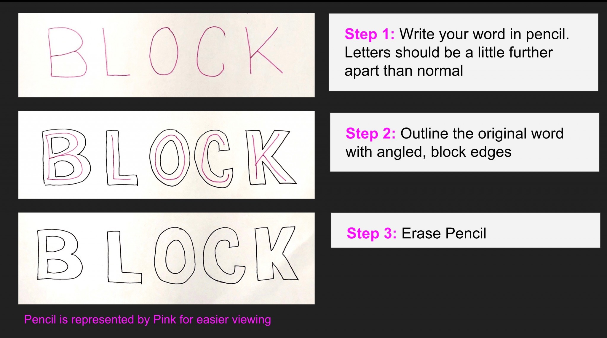
- Text: How to Draw Block and Bubble Letters. (See Below)
- Spacing: In a poster headline, draw the first letter first and last letter second. This creates a framework for spacing so that you are not cramming the rest of your letters in at the end because you ran out of space.
Technology Posters on the Computer
- Color: Just because you love all colors, does not mean you must always use all colors. Pick just a few and wisely. Do not strain people’s eyes with bright colors against black backgrounds. Try using complementary colors to make important information stand out.
- Text: Do not use decorative, fancy, script, or display fonts for paragraphs of text that you want the viewer to read. Those fonts are not good for lengthy reading.
- Spacing: Create flow with your viewers by looking at layouts of other successful posters. Appropriate the ideas to create a visual path for your facts, topics, and images.
Design Apps for Creating Posters:
- Piktochart: Found HERE. Make fantastic infographics, posters, or presentations that look amazingly professional
- Picmonkey: Found HERE Make posters using a wide variety of icons, images, fonts, and other design elements.
- Easel.ly: Found HERE Focused mostly on infographics, it has a library of templates that are easy to navigate.
- Canva: Found HERE I cannot say enough about this design application. The possibilities are truly endless.

Whether you are working on the computer or paper, remembering these easy tips and tricks will be sure to improve the look of classroom posters. When projects look good, students are proud to show them off and share what they have learned!

